Skip to content
Colours are the emotion, rhythm and soul of an interior.

The Magic of Colour in Interior Design

It is not just a background - it is atmosphere, mood and stories written in colour.
Below you will find examples of inspiring colour combinations, each with a different palette and a different character.
From creamy quiet to graphic black, from a misty forest to a retro wallpaper rhythm.
Let colours speak. Find your own tone.

click the image to see more

The magic of colour in an interior

Colours do not merely complete a space - they build it. They create atmosphere, mood and emotion.
Click to see the colour composition at full scale and feel its rhythm.

Creamy Minimalism, Light and Breathing Space
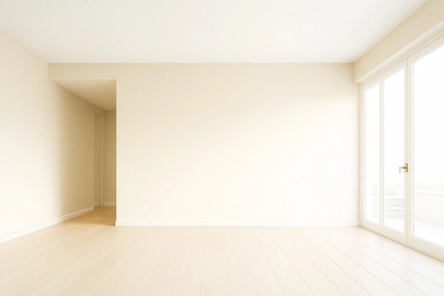
Style: Modern, Minimalist, Japandi Light, Scandinavian


Colours: Cream walls, whitewashed floorboards and light window frames - a milky vanilla palette enhanced by natural light
Impression: This interior breathes. A light palette based on warm ivory and vanilla tones creates a space full of calm and luminous clarity. The absence of contrast gives the effect of softened boundaries - ideal for relaxation, meditation and simplicity.
For whom and when: For people looking for visual quiet, ideal for working from home, reading or a daily coffee ritual. This colour direction is also an excellent base for Japandi, eco-minimalism or quiet luxury. It works well in city apartments with limited daylight, helping reflect and brighten the space.
Warm Glow, Sunlit Calm

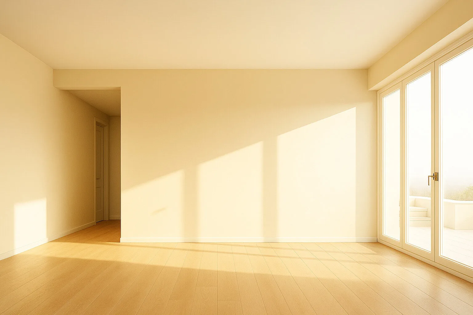
Style: Natural, Mediterranean, Japandi Warm, Wabi-Sabi


Colours: Warm beige on the walls, light honey tones on the floor and golden reflections of light - a palette inspired by sun, sand and wood
Impression: Sunlight floods the space and highlights its natural warmth. This interior feels like a slow breath - enveloping, friendly and quiet. The colours do not overwhelm; they add energy and domestic calm.
For whom and when: For those who love natural light and harmony with nature. Ideal for minimalists who want warmth rather than coolness. It works in family homes, meditation spaces and summer apartments - wherever everyday calm and light matter.

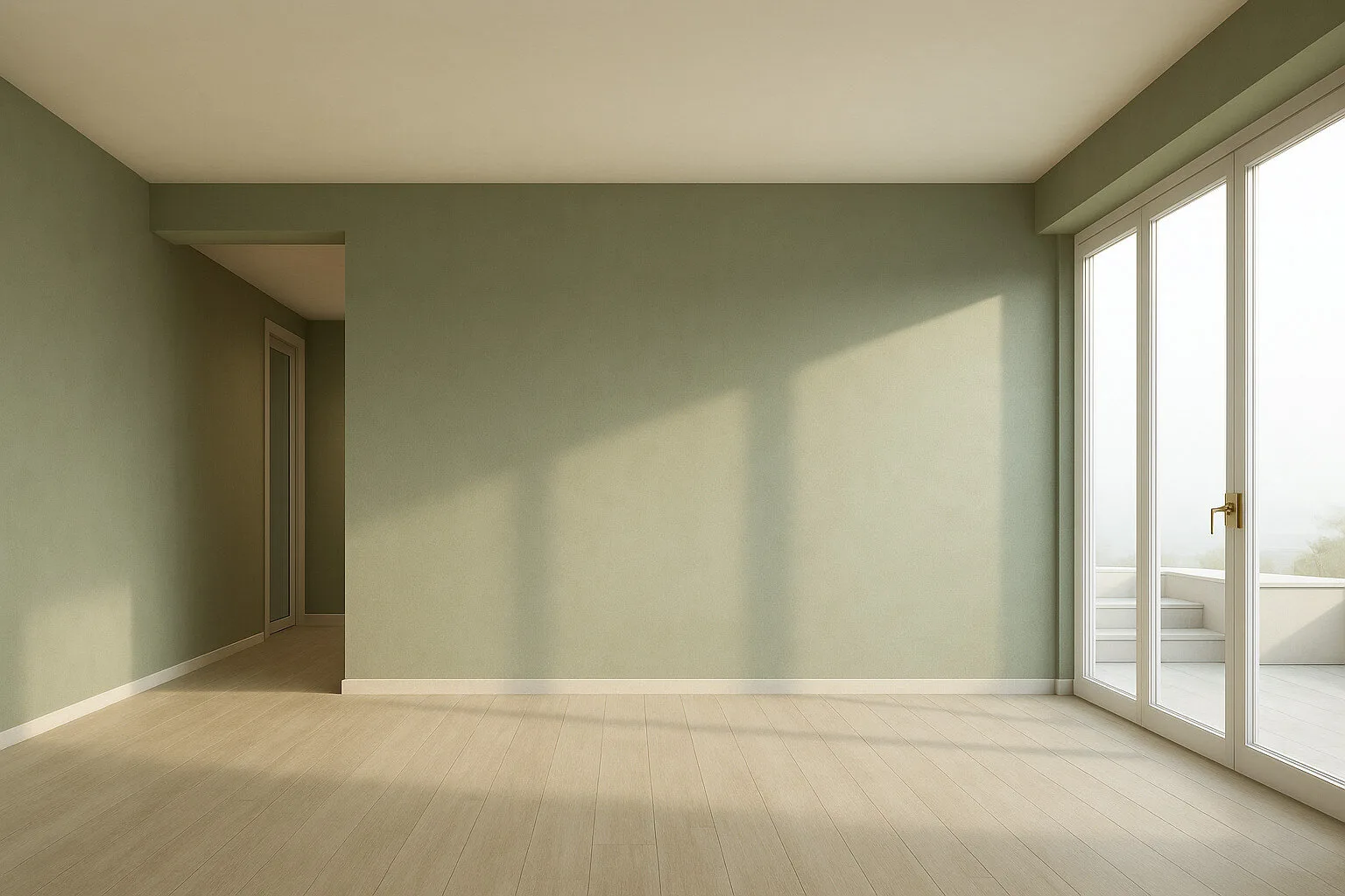
Sage Quiet, Green Balance

Style: Natural, Japandi, Mediterranean, Biophilic Design


Colours: Muted sage on the walls, light beige on the floor and soft daylight - cool green in harmony with wood
Impression: This colour scheme calms and quiets the interior. Green brings a sense of contact with nature, and paired with light wood it balances freshness with warmth. The space feels soothing, like a morning walk through the forest.
For whom and when: For lovers of nature and mindful living. Ideal for a home office, bedroom or relaxation zone. It suits people who value balance, simplicity and organic materials. This palette refreshes without overwhelming.

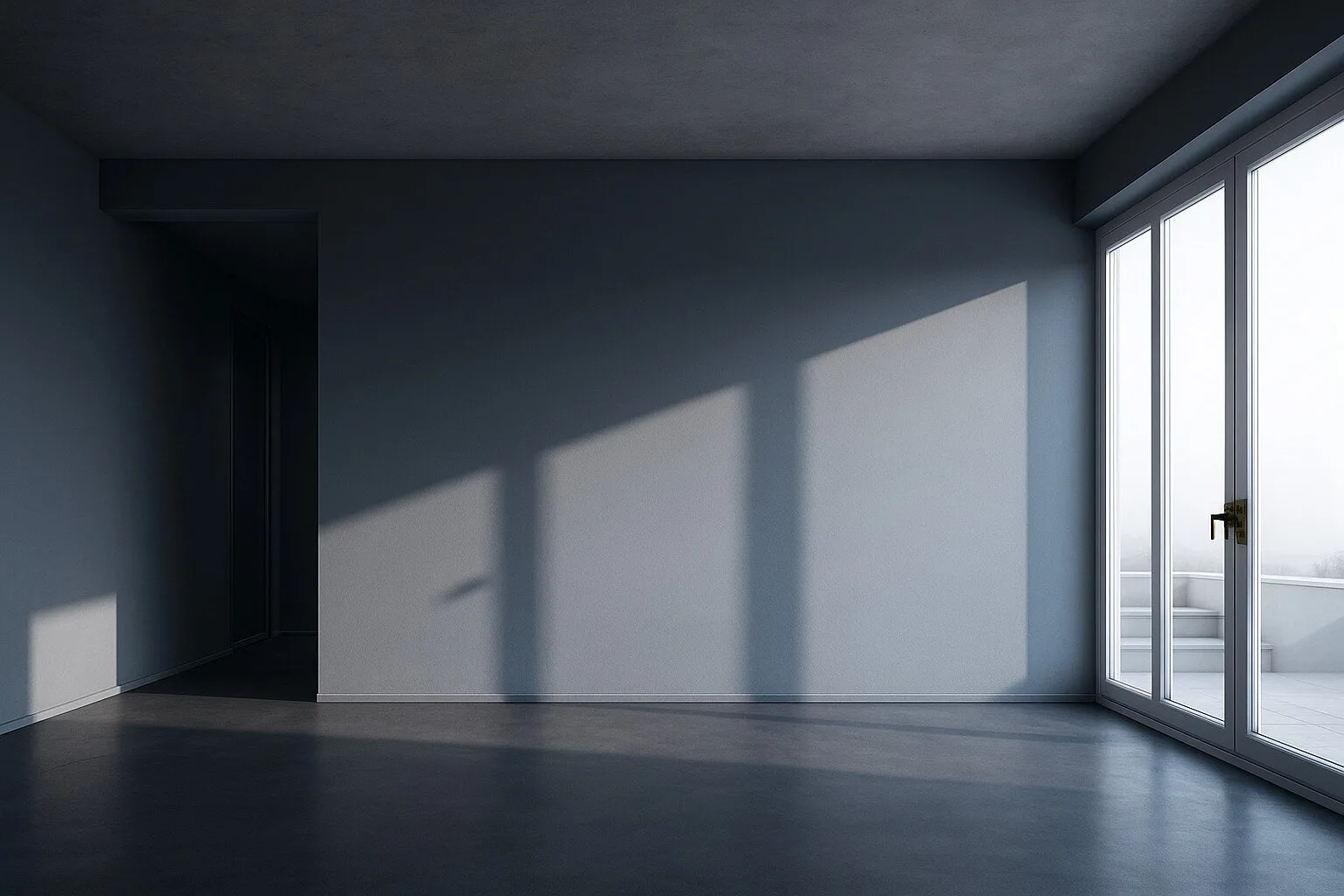
Graphite Depth, Modern Quiet

Style: Industrial, Modern, Minimalist, Monochrome


Colours: Deep graphite on the walls, cool grey flooring and reflected milky light - a palette of contrast and quiet
Impression: This interior is silent, but powerful. Graphite tones wrap the space in calm and refinement, giving it an intimate, almost cinematic character. Shadow becomes a tool here - drawing you in, calming you down and setting the rhythm.
For whom and when: For lovers of raw forms and quiet interiors. Ideal for a loft, audio zone, gallery or bedroom. It suits those who value elegance without decoration and like interiors that speak in a whisper.

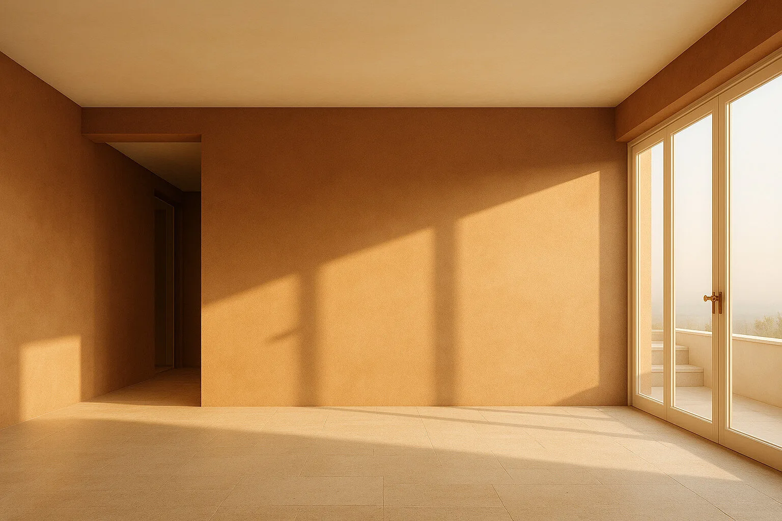
Terracotta Calm, Southern Warmth

Style: Mediterranean, Natural Boho, Earthy Tones, Slow Interior


Colours: Warm terracotta on the walls, cream stone tiles and soft light - a palette inspired by Tuscany and natural earth
Impression: This interior wraps you in warmth and calm. The colours evoke a southern siesta, a quiet moment among stone, sand and clay walls. Light deepens the saturation of the colours, creating a welcoming atmosphere of relaxation.
For whom and when: For those who love nature, sun and organic structures. Ideal for a living area, dining room, summer apartment or home studio. A space for people who value authenticity and the sensual warmth of colour.

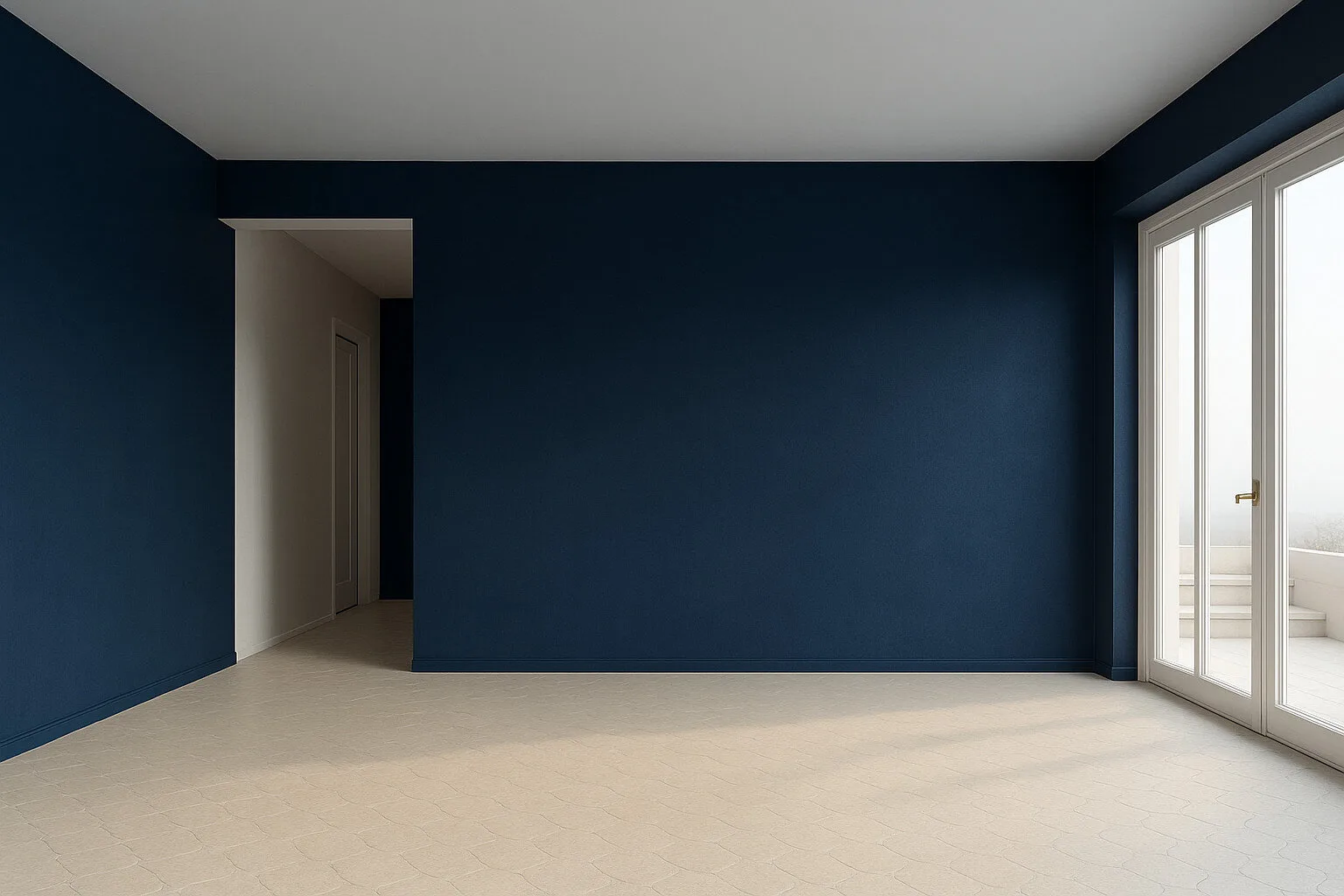
Navy Depth, Elegance in Contrast

Style: Modern Classic, Mid-Century Modern, Minimalist, Hotel Chic


Colours: Deep navy on the walls, light stone flooring and neutral whites - strong contrast with elegant balance
Impression: This interior combines the power of colour with balanced simplicity. Navy feels calming while adding depth and class. The light floor brings out the darkness of the walls, creating a harmonious play of contrasts.
For whom and when: For people who value elegance, a strong colour accent and the feeling of hotel-style comfort. Ideal for a living room, study or representative interior. A colour that makes an impression, but with class.

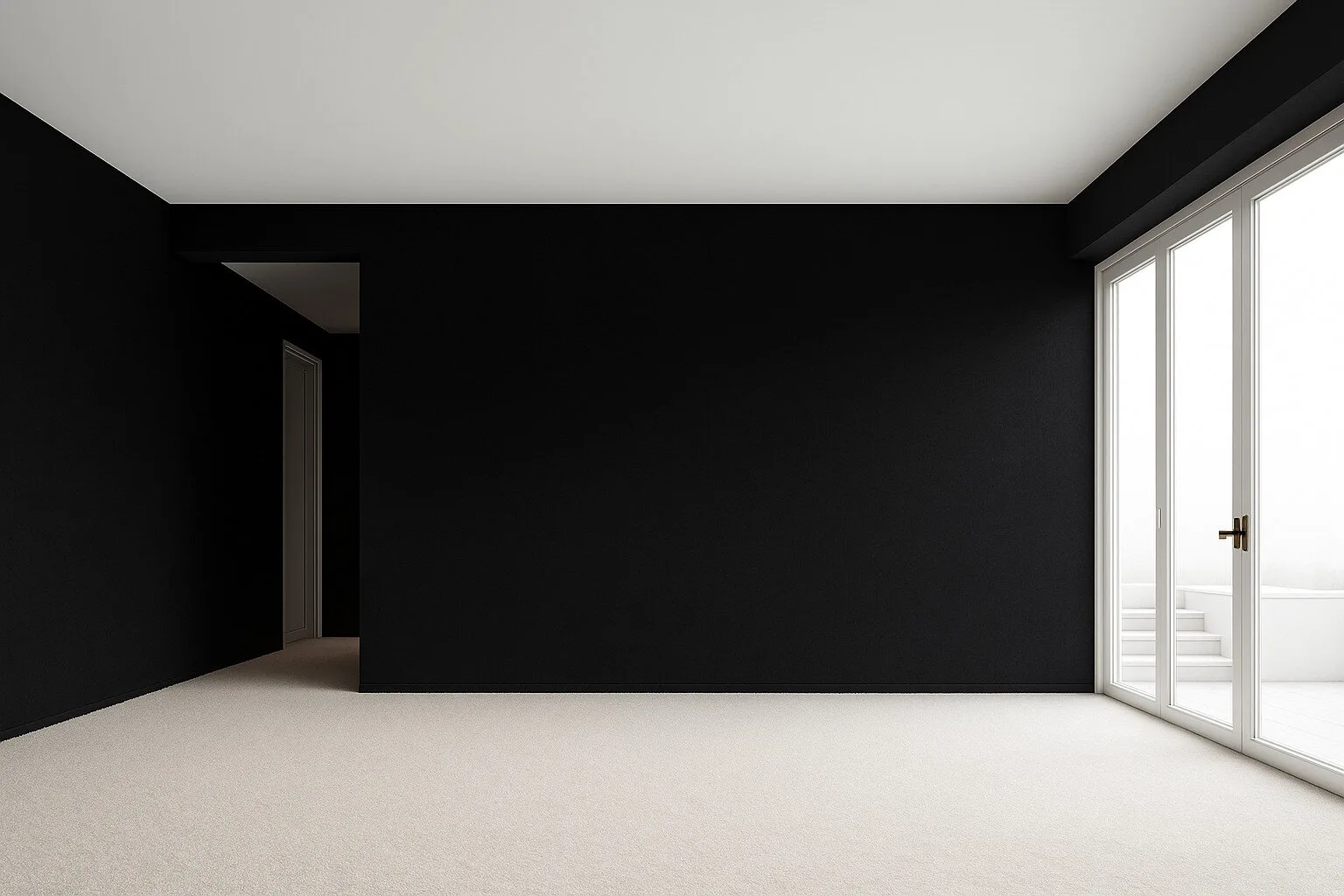
Black Frame, White Quiet

Style: Monochrome, Modern, Artistic, High Contrast


Colours: Deep black walls, velvety white flooring and sharp daylight - minimalism built on contrast
Impression: This interior works like a framed shot - precise, quiet and graphic. Black creates depth and focus, while white adds lightness. Together they form an elegant rhythm of light and shadow that can be arranged in many ways.
For whom and when: For aesthetes, artists and minimalists. Ideal for a studio, a living room with character or an exhibition zone. It works in spaces where colour does not dominate, but allows attention to settle on form, rhythm and light.

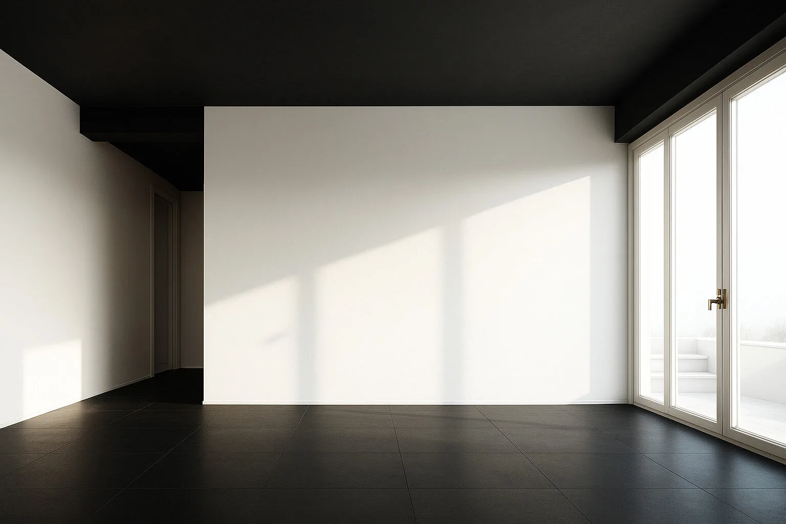
Reversed Black, Light in Contrast

Style: Modern, Elegant, Extreme Minimalism


Colours: White walls and frames, black floor and ceiling - a reversed classic full of tension and chiaroscuro
Impression: This space builds contrast by reversing the norm - black descends from above while white rises vertically. The interior becomes a background for light and shadow, playing with perception and compositional courage.
For whom and when: For design lovers with character who are not afraid to experiment. Ideal for creative spaces, a home gallery or a modern living room. A distinctive choice for those who like placing a final black dot at the end of the sentence.

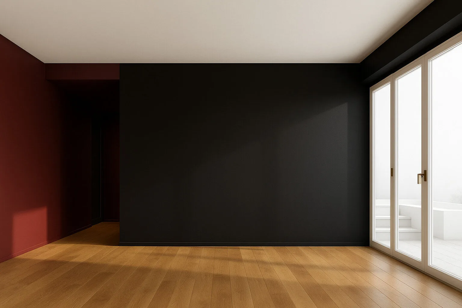
Black and Burgundy, Sensual Contrast

Style: Modern Glam, Dark Elegance, Minimalism with Character, Modern Art Deco


Colours: Deep black and matte burgundy on the walls, with a honey-toned wooden floor - an intense palette for the bold
Impression: The combination of black and red builds an atmosphere of intimacy, strength and refinement. Warm light brings out the depth of the colours, while the wooden floor balances the intensity of the palette. A cinematic interior - sensual, yet clear.
For whom and when: For lovers of strong aesthetic experiences and deliberate colour choices. Ideal for a living room, dining room, stylish office or evening relaxation zone. For those who want the interior to say:"I am confident."

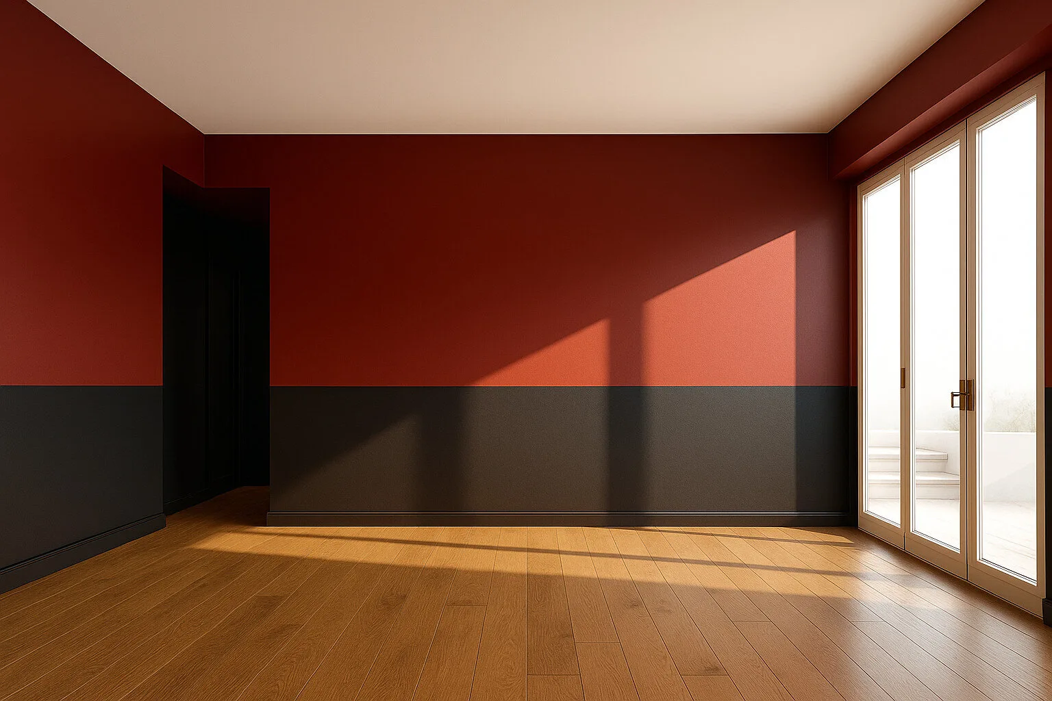
Red and Graphite, Rhythm and Character

Style: Modern Classic, Urban Chic, Eclectic, Modern Arthouse


Colours: Deep red and anthracite in a horizontal split, off-white ceiling and honey-toned wooden floor - contrast with balance
Impression: Decisive colours create a modern rhythm and graphic structure. Red warms and energises, anthracite stabilises and adds depth. The wall division builds horizontal harmony, while wood balances the whole with a natural tone.
For whom and when: For people who value expression and structure. Excellent for a dining room, living room, creative home space or modern studio apartment. This interior says:"I have energy, and I know where I am going."

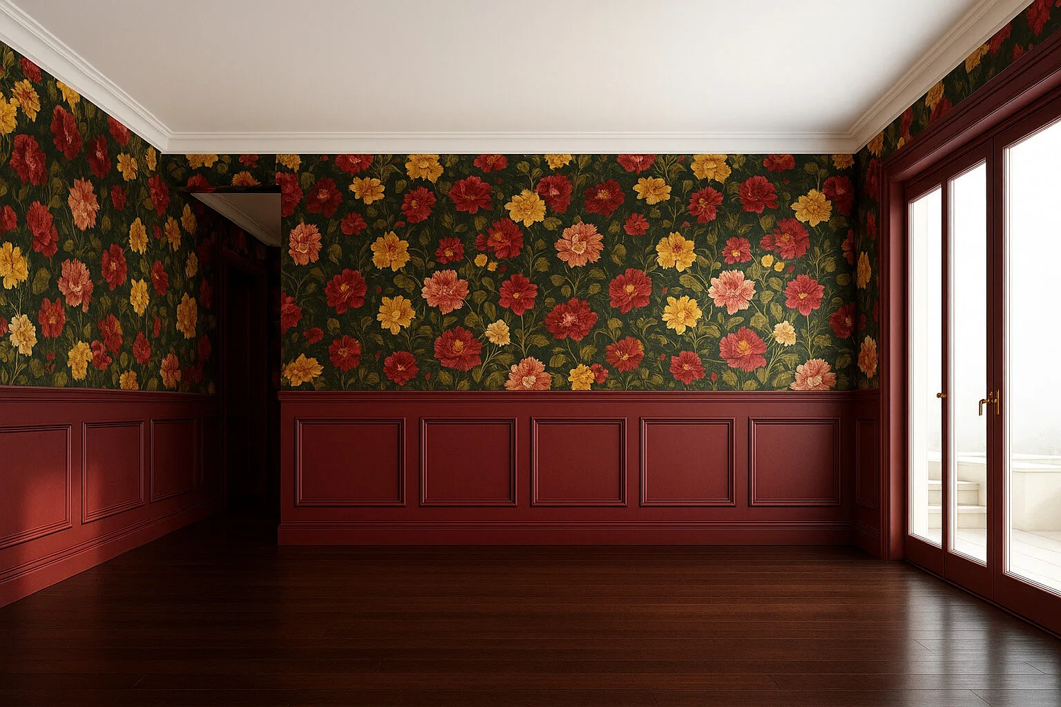
Floral Classic, Baroque Warmth

Style: Cottagecore, Classic Eclectic, Baroque Revival, Vintage Glamour


Colours: Dark green background, burgundy panelling and floral patterns in shades of red, yellow and peach - a rich, saturated palette inspired by a garden in full bloom
Impression: An interior full of depth, detail and cosy theatricality. The floral pattern enlivens the space, while the dark wall frame gives it structure. It is a room that wraps the senses, like an old library or drawing room in an English residence.
For whom and when: For romantics, collectors and lovers of classic forms and colour. Ideal for a living room with a fireplace, a reading room, a boutique interior or a stylish dining room. A choice for those who love history, texture and colours full of emotion.

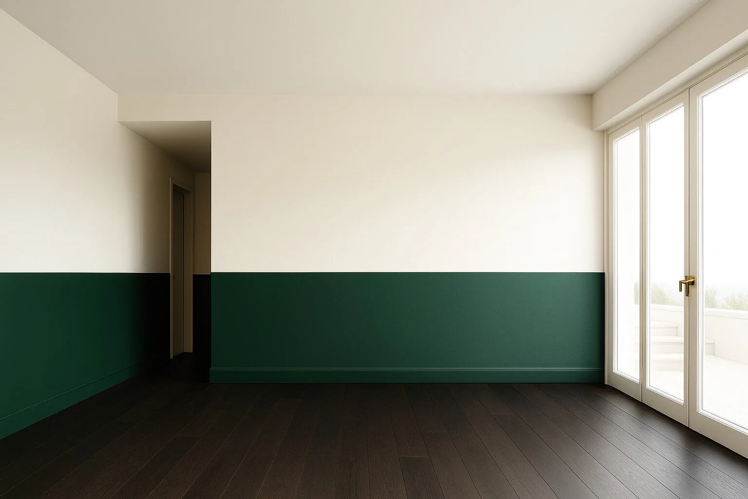
Cream and Bottle Green, Natural Balance

Style: Contemporary Classic, Earthy Modern, Townhouse Heritage, Green Minimalism


Colours: Cream in the upper part of the walls, deep bottle green below and a dark espresso-toned floor - elegance rooted in nature
Impression: This interior is built on harmony and calm. Green brings depth, stability and nature, while creamy white brightens and opens the space. The wall division adds rhythm and pleasing proportions.
For whom and when: For people who value classic style with a note of freshness. Ideal for a dining room, elegant study, city apartment or interior filled with plants. For those seeking timeless balance between light and colour.

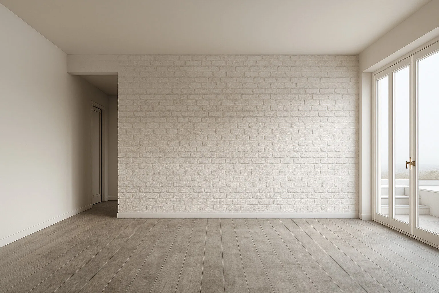
White Brick, Texture and Breathing Space

Style: Industrial Soft, Scandinavian, Natural Loft, Urban Calm


Colours: An off-white brick wall, warm beige on the remaining walls and grey-beige wood flooring - monochrome lightness with texture
Impression: This interior combines simplicity with character. White brick introduces soft texture, while the neutral palette gives the space brightness and calm. The whole feels light while remaining expressive.
For whom and when: For lovers of minimalism with a raw note. Ideal for living areas, dining rooms, studios or compact apartments. This palette becomes a background for living - never intrusive, but full of calm and balance.

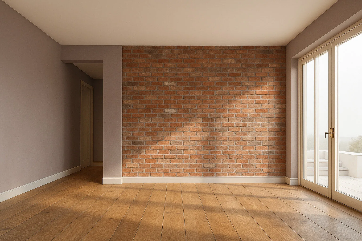
Brick and Taupe, Soft Industrial

Style: Industrial Soft, Urban Natural, City Loft, Neo-Rustic


Colours: Reddish brick, matte taupe walls and light oak flooring - a cosy mix of rawness and calm
Impression: Brick brings texture and history, while taupe walls soften the whole and create a balanced, calm background. Wood warms and grounds the space. The interior combines urban character with domestic warmth.
For whom and when: For those who like natural materials but do not want the interior to feel too raw. Ideal for open living zones, kitchens with dining areas or stylish offices. A palette that gives a sense of authenticity and balance.

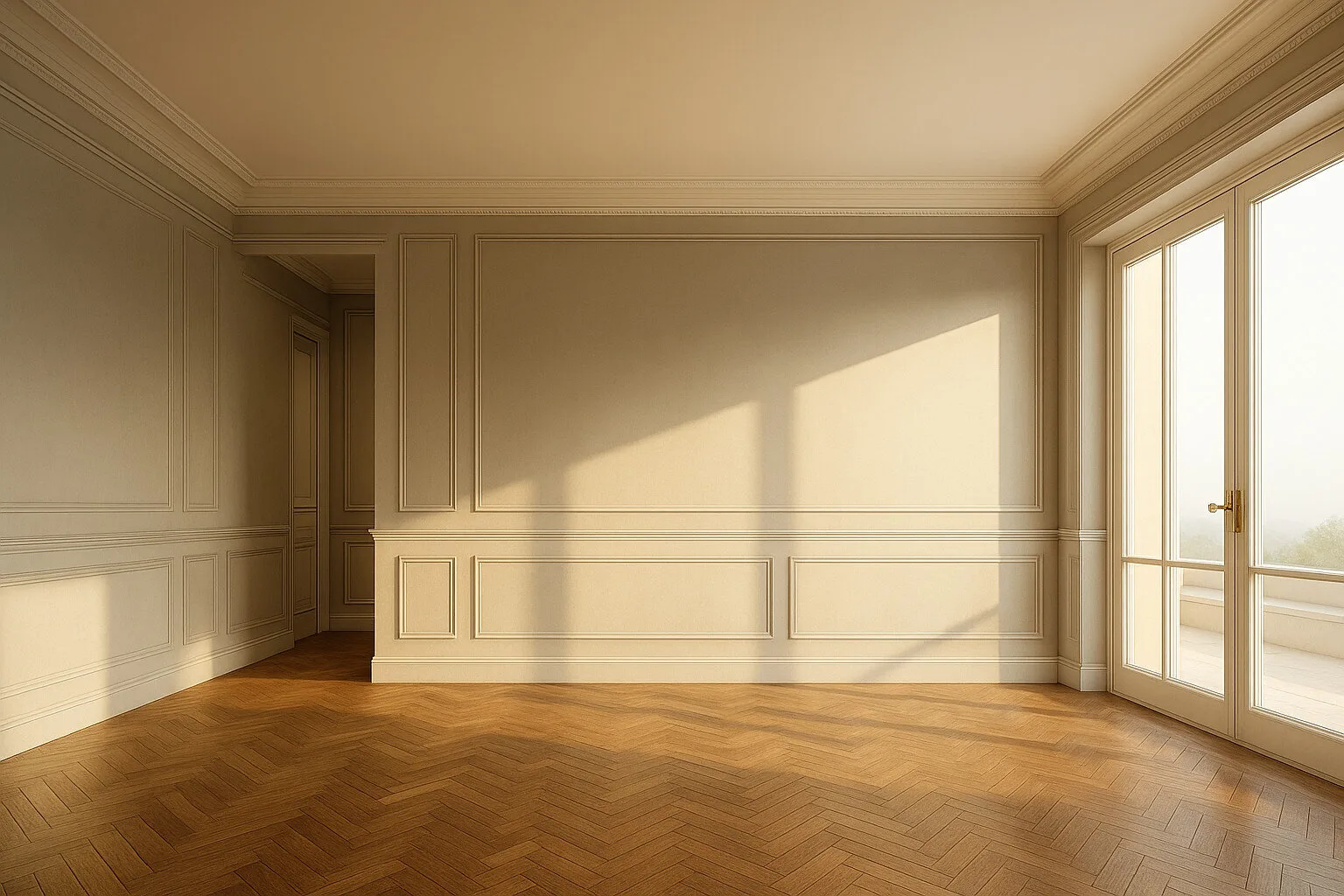
Beige and Moulding, Classic Harmony

Style: Parisian Chic, New Classic, Modern Heritage, Hotel Classic


Colours: Warm beige walls with elegant mouldings, off-white ceiling and trim, and classic herringbone flooring in a caramel tone
Impression: This interior speaks of class in a whisper. A light, warm palette illuminated by natural light creates an atmosphere of elegance and balance. Mouldings add rhythm, while the floor warms the space with noble wood grain.
For whom and when: For lovers of classic style with a contemporary note. Ideal for a living room, bedroom, stylish apartment or representative space. A palette that does not go out of fashion because it is based on harmony.

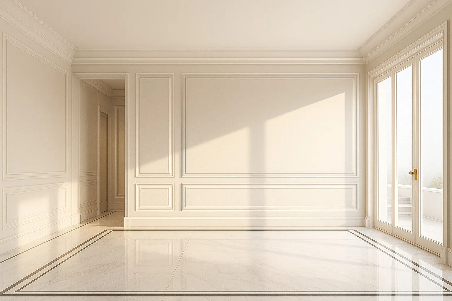
Tonal Elegance, Light and Marble

Style: Modern Palace, Art Deco Soft, Quiet Luxury, Hotel Residence


Colours: Tonal matte beige on walls and mouldings, polished light marble flooring with a decorative border - luminous, elegant monochrome
Impression: This interior builds an atmosphere of luxury through purity of form and light. Subtle tonal differences add depth, while reflections in the marble make the space live with the sun. Everything is refined, but never loud.
For whom and when: For lovers of ultra-calm elegance. Ideal for a hall, living room, boutique-style apartment or representative zone. A space where luxury equals quality and light.

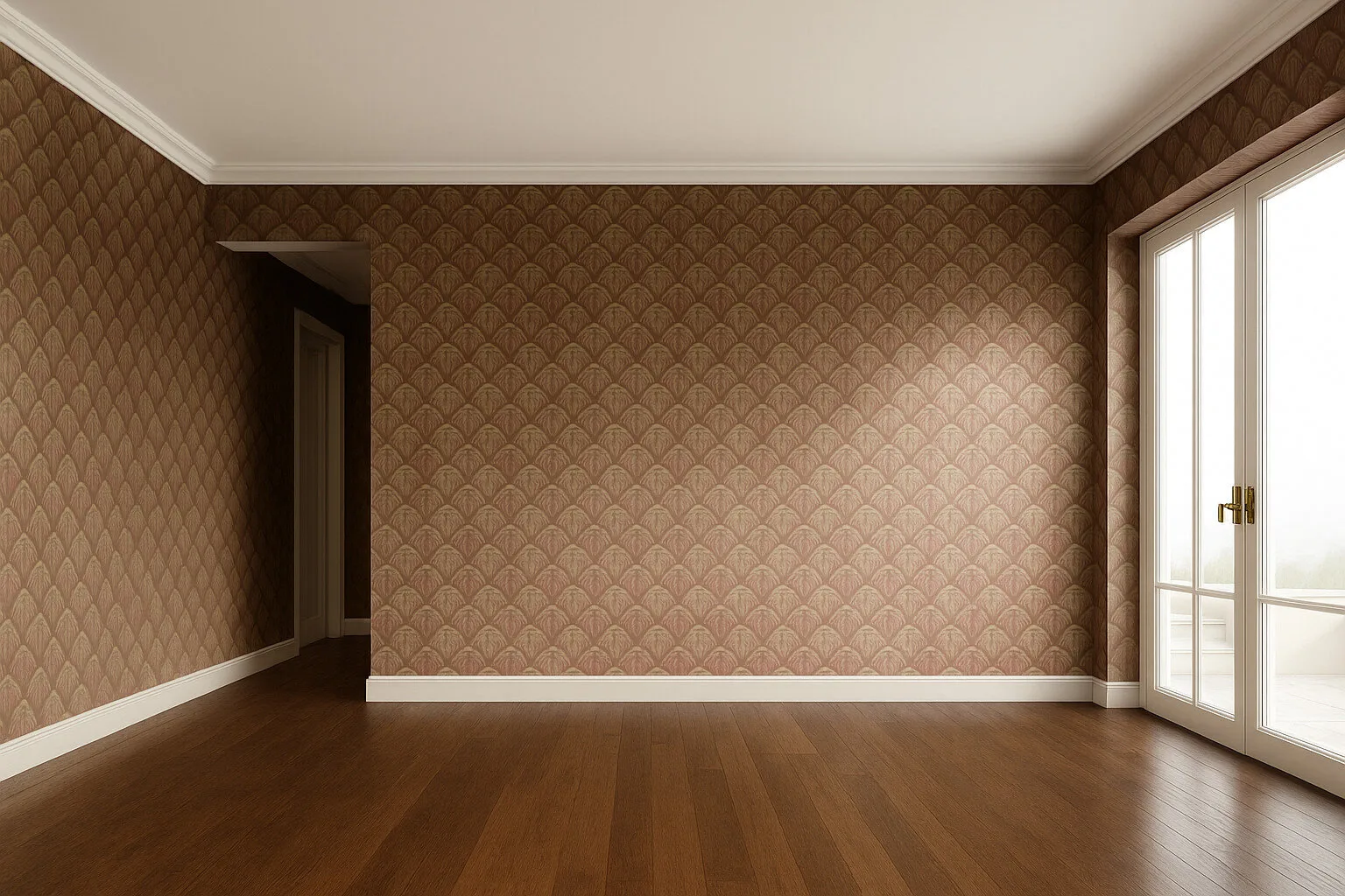
Powder Pattern, Retro with a Touch of Elegance

Style: Retro Glam, Art Deco Soft, Vintage Revival, Drawing Room Classic


Colours: Powder-pink wallpaper with a pearlescent fan pattern, white trim and a warm chocolate floor - a moody and refined retro palette
Impression: This interior feels like a memory from another era - classy, soft and full of noble detail. The wall pattern gives the space rhythm and depth, while the dark floor adds contrast and stabilises the composition.
For whom and when: For people who value feminine elegance and a decorative interior character. Ideal for a boudoir, living room, reading corner or stylish home office. A space that tells a story through colour and ornament.

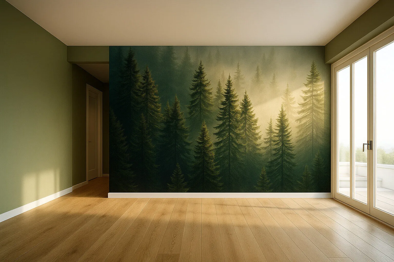
Forest in Mist, an Interior with Breathing Space

Style: Biophilic Design, Nature Modern, Japandi Organic, Slow Interior


Colours: Olive forest green on the walls, natural wood flooring and a mural in the tones of a spruce forest wrapped in morning light
Impression: This interior breathes with nature. Deep green envelops the space, while the misty forest mural brings quiet, depth and contemplation. The whole creates immersion in nature without leaving home.
For whom and when: For people seeking inner balance and loving contact with nature. Ideal for meditation, rest or creative work. A space that heals through sight and mood.


Sometimes the best decision starts right here

See what else is worth discovering

Not everyone lands immediately on what they truly need.
That is why we have gathered a few paths that help you look at finishing and renovation from different angles.
Sometimes one right topic is enough for the whole picture to start making sense.

Partner Programmes

Good cooperation also needs to be well built

We support architects, developers and designers as a trusted execution partner. On time, flexible and focused on quality at every stage of the project.

What you gain with us

Peace of mind that lasts

You gain not only a well-finished interior, but also clear rules, real support and the sense that the whole process is handled responsibly from start to finish.

Styles that inspire

Every interior has its own language

From calm elegance to bolder directions, see styles that help give an interior character and build a space that genuinely feels close to you.

Back to top